

Discover the influence that the colors of your room have on your daily life and how you can take advantage of them according to your personality.
Colors and how they affect our mood
Each color can affect your mood without you knowing it, and they change your mood and even many times we attribute certain sensations to the body to the day, without realizing the influence of colors that cause these different changes in mood.
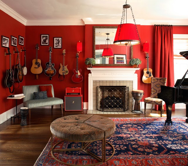
Red colors in the rooms that affect your mood
Red raises the energy level of a room. It is a good option when you want to arouse enthusiasm, especially at night. In the living room or dining room, red brings people together and stimulates conversation. In an entry, a strong first impression is created. Red has been shown to raise blood pressure, respiration, speed, and heart rate. It is generally considered too stimulating for bedrooms, but if you are only in the room at night, you will be seeing it only by light from the lamp, when the color appears muted, rich and elegant. The eye, the most intense, pumps adrenaline like no other tonality.
The influence of yellow on our mood
Yellow captures the joy of the sun and communicates happiness. It’s perfect for kitchens, dining rooms, and bathrooms, where bright colors are energizing and uplifting. In hallways, entryways, and tight spaces, yellow can feel expansive and welcoming. Even though yellow is a cheerful color, it is not a good choice to use in main color schemes when it comes to designing a room. Studies show that people are more likely to lose their temper in a yellow interior. Babies also seem to cry more in a yellow room. In large quantities, color tends to create feelings of frustration and anger in people. In chromotherapy, yellow is believed to stimulate the nerves and purify the body.
How the color blue affects our mood?
Blue is said to lower blood pressure, cause slower breathing and heart rate. This is why it is considered calming, relaxing, and serene, and is often recommended for bedrooms and bathrooms. Be careful though: a pastel blue can get so unpleasantly cold when on walls and furniture, especially in a room that receives little natural light.
If you opt for a light blue as the main color in a room, balance it with warm tones of furniture and fabrics. To encourage relaxation in social areas (family rooms, living rooms, large kitchens) consider warmer blues, such as periwinkle, or bright blues, such as azure or turquoise.
Blue is known to have a calming effect when used as the main color of a room. Choose softer tones of blue. Dark blue has the opposite effect, as it can evoke feelings of sadness. So, refrain from using darker blue in your main color scheme. Stick with the lighter shades of blue to give you and your loved ones a calming effect.
The color green affects our mood and relieves stress
Green is considered the most relaxing color for the eye. Being the result of the combination of the refreshing quality of blue and the joviality of yellow, green is suitable for almost any room in the house. In the kitchen, green cools things down, in a family room or living room, it encourages relaxation , but has enough warmth to promote comfort and togetherness.
Green also has a calming effect when used as the main color for decoration. It is believed to relieve stress by helping people relax. It is also believed to help with fertility, making it a great option for the bedroom.
Other colors that affect our mood
Purple in its darkest values (aubergine, for example) is rich, dramatic, and sophisticated. It is associated with luxury and creativity, and as an accent or secondary color, it gives a depth scheme. Lighter versions of purple, such as lavender and lilac, bring the same quality of sleep to bedrooms as blue does, but without the risk of feeling cold.
The color orange evokes emotion, enthusiasm and is a color full of energy. Although not a good idea for a living room or for bedrooms, this color is ideal for an exercise room. It will bring out all the emotions that you need to release during your exercise routine. In ancient cultures, orange was believed to heal the lungs and increase energy levels.
Neutrals (black, gray, white and brown) are essentials for the decorator’s toolkit. All neutral schemes fall in and out of fashion, but their virtue lies in their flexibility: Add color to liven things up; subtract him and calm the spirits. Black is the most used in small doses to accentuate.
In fact, some experts argue that every room should have a touch of black to ground the color scheme and add depth. To make the job easier, you can use the most important color interior design tool – the color wheel.
Crimson can make some people feel irritable by invoking feelings of anger and hostility. It is a color that should be avoided as the main color of the room. Sitting for long periods of time in a room painted in this color is likely to affect the peace and harmony that you intend to create in your home.
Color effects on walls and ceiling
The ceiling makes up one sixth of the space in a room, but too often nothing more than a coat of white paint is done. In fact, for decades, the color white has been considered not only the safest but also the best option for ceilings. As a general rule of thumb, ceilings that are brighter than walls feel higher, while those that are darker feel lower.
Being lower doesn’t have to mean claustrophobic: low ceilings can visually evoke cozy intimacy. As a general rule of thumb, dark walls make a room appear smaller, and light walls make a room appear larger.
These general guidelines are a good starting point in your search for a paint color. But remember that the choice of color is a very personal matter. You are the one who has to live with your new paint color, so choose a color that suits you, your family and your lifestyle.


